Design Systems & Brand Architecture
Dashboard Design System
A self-directed project to evolve a dashboard design system consistent with j2pro brand, creating a sophisticated, dark-mode UI kit that reflects deep expertise in AI, enterprise systems, and architectural precision.
Video caption: j2pro.net UI Kit: Dashboard Design System - a self-directed project to evolve my personal brand and architect a UI kit that truly reflects a deep focus on AI, enterprise systems, and strategic design. Tools: Google AI Studio, Figma, Figma Make AI beta.
The Challenge
My existing dashboard design system, while clean and professional, was built on a light-themed design language that no longer fully represented the evolution of my expertise. As my focus deepened on AI, enterprise systems, and dark-mode interfaces common in high-stakes environments, my own brand needed to reflect that "sophisticated intelligence." The challenge was to reimagine and architect a new, world-class design system for my own dashboard design system from the ground up.
"My dashboard design system needed to be a testament to my process. It had to be built on the same principles of architectural precision and systematic design that I bring to my clients."
My Process
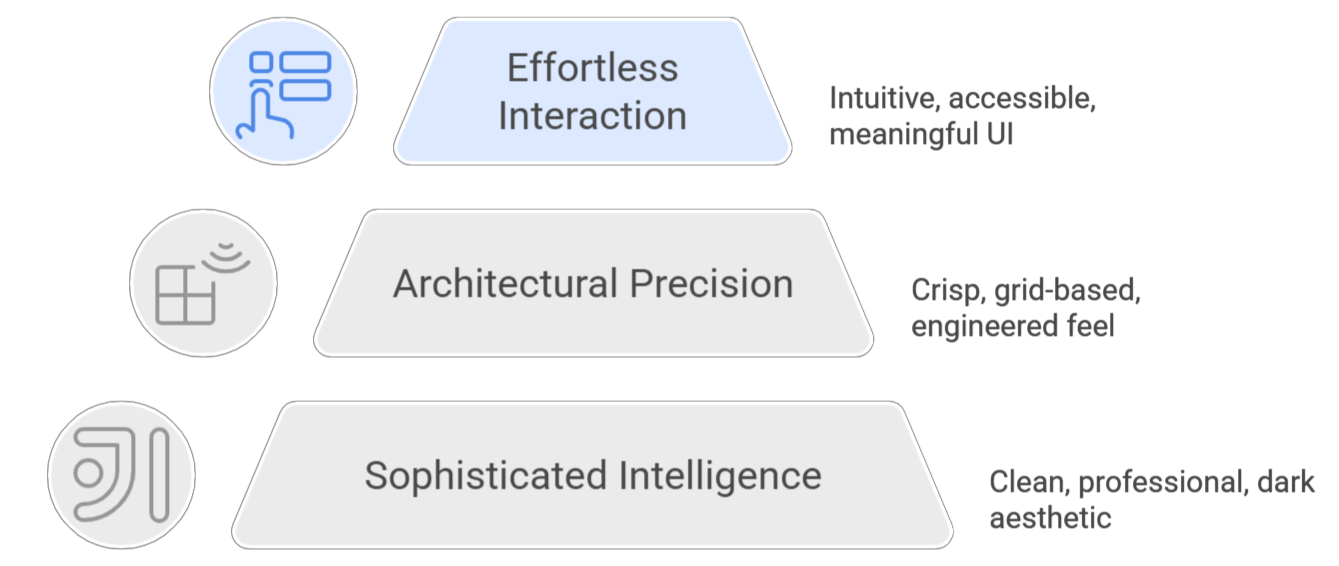
1. Establishing the Core Design Philosophy
The project began not with pixels, but with principles. Before designing any component, I defined a new core philosophy to act as the project's north star: Sophisticated Intelligence (a clean, professional, dark aesthetic), Architectural Precision (a crisp, grid-based, engineered feel), and Effortless Interaction (intuitive, accessible, and meaningful UI).
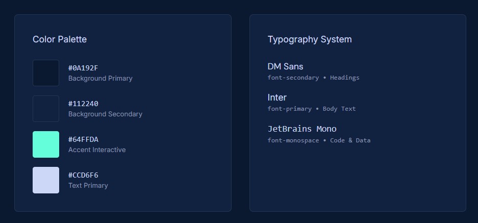
2. Architecting the Evolved Design Tokens
With the philosophy set, I architected the foundational layer: the design tokens. I developed a new dark-mode-first color palette with a rich navy background and a vibrant teal/mint accent for interactive elements. I established a clear typographic hierarchy and a consistent 8px grid for spacing, codifying all these decisions into CSS custom properties to serve as the single source of truth for the entire system.
)
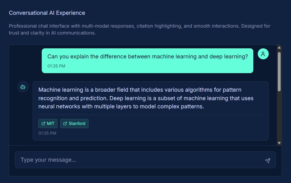
3. Component Generation & Prototyping
The final phase was to translate the abstract rules and tokens into a comprehensive library of tangible UI components. I designed and built a full suite of elements, including buttons, forms, notifications, dashboard cards, and advanced patterns for state machines and AI chat interfaces. Each component was meticulously crafted to meet the core philosophy and strict accessibility mandates.
The Outcome & Impact
The result of this self-directed sprint is a complete, world-class UI kit that elevates the j2pro.net brand and serves as a powerful, scalable foundation for all future dashboard design system content. The system is a direct reflection of my professional capabilities.
Learnings & Reflections
This project was a profound exercise in "dogfooding"—applying my own professional process to my own brand. The biggest takeaway was the immense value this rigor brings. By forcing myself to articulate a philosophy and build a systematic, token-based foundation before creating a single final component, the result was infinitely more cohesive and scalable. It proved that a design system is the ultimate tool for translating strategic intent into tangible, high-quality execution.
This architectural approach is especially critical when designing for data-rich environments. The components in this UI kit were not created in a vacuum; they were designed as the building blocks for sophisticated dashboard UI patterns. Architecting a system to handle high information density, ensure at-a-glance clarity, and reduce cognitive load requires a deep understanding of UX architecture. It's about creating a predictable visual language that allows users to find signal in the noise, a principle that guided the development of every metric card, form control, and data display in this system.
Ultimately, a design system's true purpose is to provide UX/UI guidance at scale, creating a single source of truth that empowers teams to build better and faster. A primary focus of this system was to address the unique interaction challenges presented by modern AI, ensuring the foundational components were robust enough for next-generation interfaces. The components for chat, state machines, and notifications are the direct result of this forward-looking approach. To see these architectural principles applied to specific, high-stakes scenarios, explore my growing library of AI Interaction Pattern Library →.
Capabilities →
All Work →
AI Interaction Patterns →
About →
Skills →